Past and future of Norway's demography, animated.
10 Jun 2018
Statistics Norway has a wonderful API for their trove of open data. I have played around with it before. This time I got hold of historical population data from 1946 and onwards as well as population projections by national background up to 2100. Inspired by various R people on Twitter, incl. Thomas Lin Pedersen, I decided to make some animated population pyramids using gganimate.
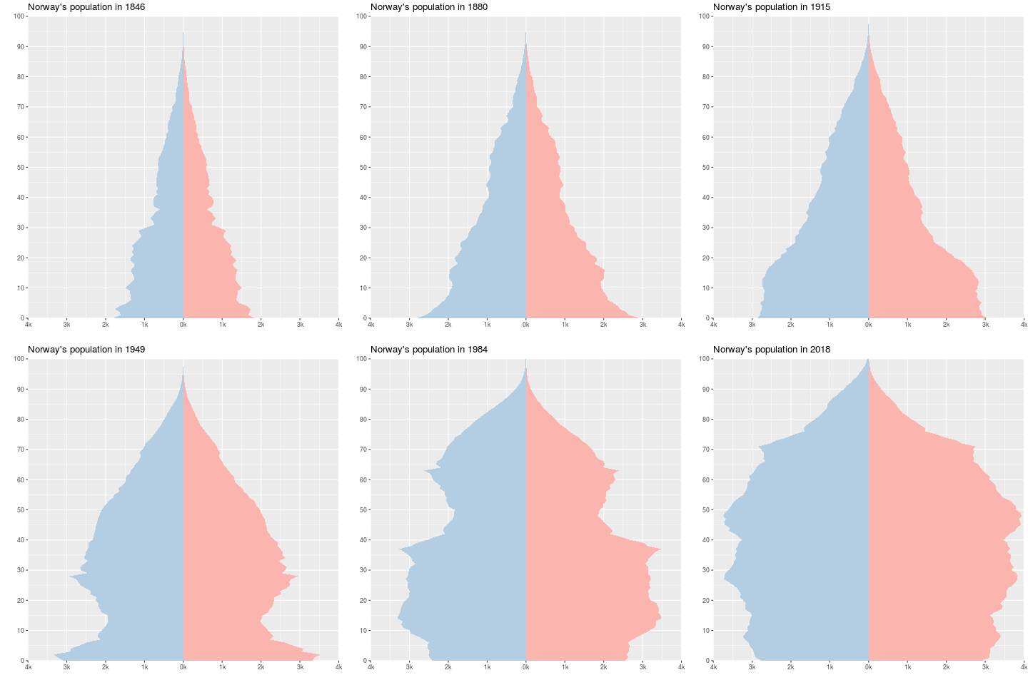
The first GIF shows how Norway’s population change as it progresses throughout the demographic transition, and moves into the below-replacement era.

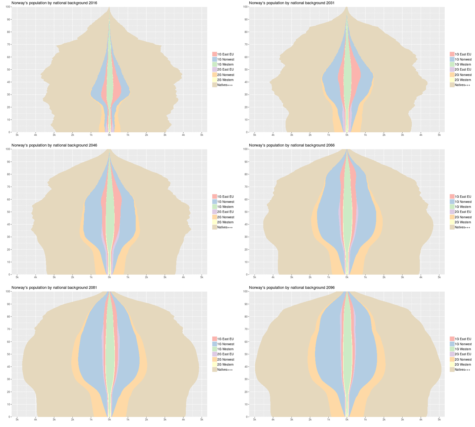
The second shows how the national composition of Norway’s population will change over this century according to the latest national background projections.

I think the ease with which one now can make animated graphs is a very useful feature for teaching and many other presentation purposes. There is only a little extra work involved in order to animate plots, and the animation can of course take place by not only time but also other variables.
My GIFs are very basic. I might make an update later in order to speed them up, and possibly add some extra details. For now, the whole thing is here. Of course, these are just amateurish compared with the beautiful demography-viz work of Kieran Healy, that you can find on his blog.
Except where noted, this website is licensed under a Creative Commons Attribution 4.0 International License.